Best Living Room Paint Colors Recommended by Top Interior Designers
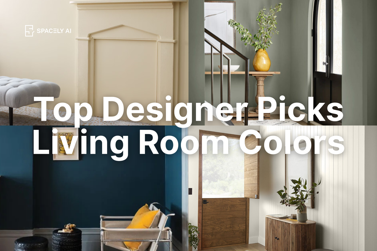
Choosing the right paint color for your living room is one of the most important design decisions you’ll ever make. After all, your living room is the centerpiece of your home — a space where you relax, entertain guests, and express your personal style. That's why we’ve gathered insights from top interior designers to share the best living room paint colors that can completely transform your space. Whether you're aiming for calm and cozy, bold and dramatic, or light and airy, this list has a perfect shade for you.
🛋️ Why Your Living Room Paint Color Matters
The paint color you select can affect the mood, light, and perceived size of your living room. It can create a feeling of warmth and intimacy or open up the space for a more airy, expansive vibe. Top designers emphasize that choosing the right paint is about more than just picking a color you like — it's about curating a mood that fits your lifestyle.
🌟 The Top Living Room Paint Colors to Consider
Here’s a look at the best living room paint colors interior designers are raving about in 2024:
1. Benjamin Moore - Edgecomb Gray

- Why Designers Love It: Soft and neutral, Edgecomb Gray strikes the perfect balance between warm and cool tones, making it an ideal backdrop for virtually any living room style.
- Pro Tip: Pair it with white trim and layered textures to create a cozy, inviting atmosphere.
- 🎨 Try this color in your space — Room Color Visualizer
2. Farrow & Ball - Hague Blue

- Why Designers Love It: Hague Blue delivers deep, sophisticated elegance. It's especially dramatic when paired with contrasting light furnishings.
- Pro Tip: Use in rooms with good natural light to avoid the space feeling too dark.
- 🎨 Try this color in your space — Room Color Visualizer
3. Benjamin Moore - White Dove

- Why Designers Love It: An iconic soft white that manages to be clean without feeling stark, White Dove creates a canvas that's versatile for any decorating style.
- Pro Tip: Combine with bold accent pieces for a modern yet timeless look.
- 🎨 Try this color in your space — Room Color Visualizer
4. Sherwin-Williams - Evergreen Fog

- Why Designers Love It: Chosen as Sherwin-Williams' Color of the Year, Evergreen Fog brings a calming blend of green and gray that evokes nature indoors.
- Pro Tip: Complement with natural materials like wood and linen for a serene, organic atmosphere.
- 🎨 Try this color in your space — Room Color Visualizer
5. Behr - Blank Canvas

- Why Designers Love It: A warm white that's both cozy and sophisticated, Blank Canvas is perfect for minimalist or Scandi-style living rooms.
- Pro Tip: Pair it with soft pastel accents to maintain a peaceful, neutral foundation while adding personality.
- 🎨 Try this color in your space — Room Color Visualizer
6. Benjamin Moore - Revere Pewter

- Why Designers Love It: A classic greige (gray + beige), Revere Pewter is timeless and incredibly adaptable, working with modern, traditional, and eclectic designs.
- Pro Tip: Bring in colorful decor elements to create dynamic contrast.
- 🎨 Try this color in your space — Room Color Visualizer
7. Sherwin-Williams - Alabaster

- Why Designers Love It: This creamy, warm white has a softness that feels welcoming without being yellowy.
- Pro Tip: Best for open-concept homes wishing for subtle division through delicate color changes.
- 🎨 Try this color in your space — Room Color Visualizer
8. Farrow & Ball - Dead Salmon

- Why Designers Love It: A stunning muted pinkish-brown, Dead Salmon lends a cozy, heritage feel that's gaining popularity in sophisticated interiors.
- Pro Tip: Partner it with darker woods and vintage pieces to enhance its rich, historical vibe.
- 🎨 Try this color in your space — Room Color Visualizer
9. Clare Paint - Money Moves

- Why Designers Love It: A chic, earthy green that's versatile enough to go modern, minimal, or bohemian.
- Pro Tip: Looks stunning with brass accents and rich textiles like velvet or linen.
- 🎨 Try this color in your space — Room Color Visualizer
10. Dunn-Edwards - Art and Craft

- Why Designers Love It: A deep, soulful brown that makes a bold statement while still feeling incredibly grounded and natural.
- Pro Tip: Ideal for creating cozy corners or accent walls in a larger living area.
- 🎨 Try this color in your space — Room Color Visualizer
11. Benjamin Moore - Chantilly Lace

- Why Designers Love It: A crisp, clean white that's perfect for spaces where you want a fresh, bright feel without any undertones peeking through.
- Pro Tip: Works beautifully in both traditional and modern spaces — a true chameleon.
- 🎨 Try this color in your space — Room Color Visualizer
12. Farrow & Ball - Setting Plaster

- Why Designers Love It: A soft, blush-like hue that feels romantic without being overly feminine.
- Pro Tip: Highlight with gold or brass fixtures for a touch of quiet luxury.
- 🎨 Try this color in your space — Room Color Visualizer
13. PPG - Olive Sprig

- Why Designers Love It: This soothing yet eye-catching green is evocative of rebirth and renewal, perfect for giving your living room a fresh start.
- Pro Tip: Pairs gorgeously with warm neutrals and natural materials.
- 🎨 Try this color in your space — Room Color Visualizer
14. Sherwin-Williams - Urbane Bronze

- Why Designers Love It: A rich dark bronze that brings drama and sophistication, especially when used on all four walls.
- Pro Tip: Combine with lighter upholstery or metallic accents to balance the depth of the color.
- 🎨 Try this color in your space — Room Color Visualizer
15. Benjamin Moore - Hale Navy

- Why Designers Love It: A deep navy with gray undertones that's particularly striking in modern or preppy interiors.
- Pro Tip: Contrast it with crisp whites or fresh greens for a standout palette.
- 🎨 Try this color in your space — Room Color Visualizer
💡Tips for Choosing Your Perfect Living Room Paint Color
With so many incredible options, it can feel overwhelming to choose! Keep these expert tips in mind:
- Test Before Committing: Always sample a few colors on your wall and observe them at different times of day.
- Consider Your Room’s Lighting: North-facing rooms tend to cool colors, while south-facing rooms can handle bolder hues.
- Think About Flow: Your living room should harmonize with adjacent spaces, especially in open-concept layouts.
- Style Matters: Choose a color that complements your overall décor theme — be it coastal, minimalist, rustic, or glam.
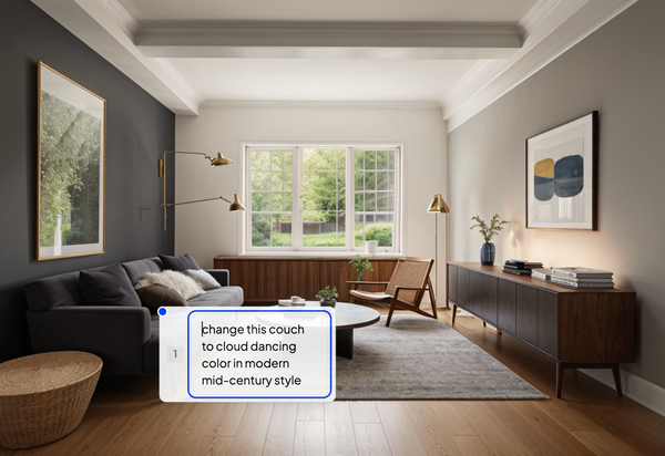
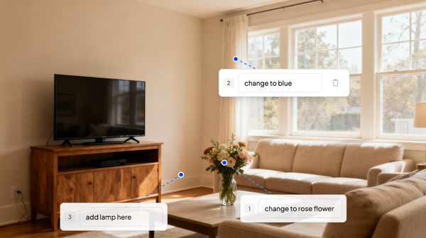
🎨 Want to See These Colors on Your Own Walls?
Don’t just imagine it—try it instantly with our free Room Color Visualizer. Upload a photo of your living room and explore all these trending paint colors in real time. Perfect your palette before you pick up a brush!
💙 If you enjoyed this content and want more interior design ideas, don’t forget to subscribe to our blog. Stay tuned with Spacely AI’s Design Diaries for the latest insights and innovations in design. Together, let’s explore, innovate, and redefine the boundaries of design.
For more information and media inquiries, please contact
Website: spacely.ai
Facebook: facebook.com/spacelyai
Instagram: instagram.com/spacely.ai
X: x.com/spacelyai
Email: hello@spacely.ai